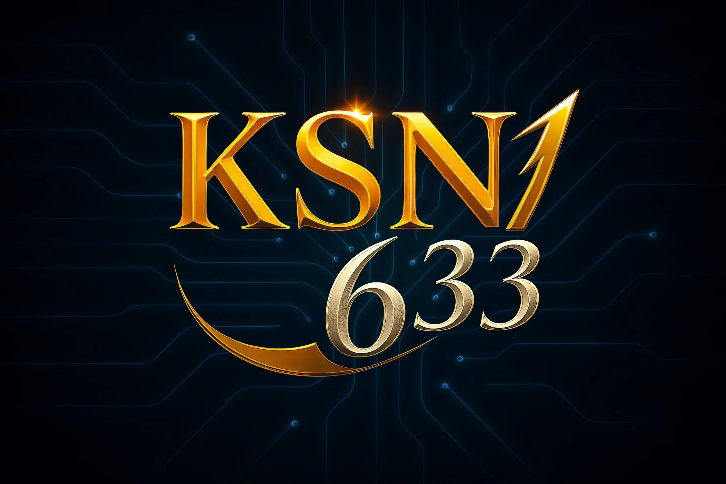
The KSN633 Logo
More Than a Mark — A Message
The KSN633 logo is not simply a visual identifier.
It is a testimony in symbol form — a condensed expression of faith, movement, purpose, and light.
Every curve, color, and contrast was chosen intentionally to reflect the heart of Kingdom Seekers Network 633.
This page exists to explain why the logo looks the way it does — and what it represents for those who carry it forward.
The Meaning Behind the Name: KSN633
KSN stands for Kingdom Seekers Network — a community built around seeking God’s Kingdom first, not as an abstract idea, but as a lived, daily pursuit.
633 is drawn from Matthew 6:33:
“But seek first the kingdom of God and His righteousness, and all these things will be added to you.”
The number is not decorative.
It is foundational.
It anchors the entire mission in Scripture and reminds us that seeking comes before building.
The Golden KSN — Light, Authority, Calling
The KSN portion of the logo is rendered in gold, symbolizing:
Divine light — God as the source, not the outcome
Worth and permanence — faith refined, not fleeting
Calling and stewardship — responsibility, not ego
Gold has historically been associated with what is sacred, enduring, and set apart.
In the KSN633 logo, it represents the Kingdom itself — radiant, immovable, and higher than trend or platform.
The Silver 633 — Motion, Faith in Action
The 633 appears in silver, italicized and slightly ascending. This design choice communicates:
Movement — faith that does not remain still
Forward momentum — obedience in motion
Human response — choosing, stepping, acting
Silver reflects light rather than generating it — a reminder that we do not create truth; we carry it forward.
The upward angle signals growth, pursuit, and progress — never perfection, always direction.
The Arc — Direction Shaped by Presence
Flowing through the logo is The Arc — a curved, ascending line that represents movement guided by divine presence.
The Arc is not about speed or spectacle.
It is about trajectory.
It symbolizes progress that is intentional, not frantic — the difference between running aimlessly and walking aligned.
The Arc can also be read as breath — a visual echo of life being spoken into motion.
Not forced.
Not loud.
Simply present.
It reflects the quiet truth that we do not move alone.
We move carried.
The Arc never overpowers the logo. It does not demand attention.
This restraint is intentional — representing God’s guidance that is real even when it is unseen.
We still choose to move.
But we are not choosing blindly.
The Arc does not close into a loop.
There is no sense of arrival — only continuation.
Because seeking the Kingdom is not a destination.
It is a posture.
The Circuit Lines — Connection and Reach
The circuit lines represent connection.
They remind us that faith is not meant to be lived alone or kept to ourselves.
Just as circuits carry energy from one place to another, these lines reflect how truth, encouragement, and hope are meant to flow through people, not stop with one person.
They also point to the idea of a network — many parts working together, each playing a role, all connected to the same source.
Finally, the circuit lines represent the use of technology to spread God’s Word — reaching across cities, nations, and cultures, so the message of Christ can travel farther than any one voice ever could.
Simply put:
What God does in one life is meant to move through many — and reach the nations.
The Glow — Presence, Not Performance
The subtle glow surrounding the logo is not about spectacle.
It represents:
God’s nearness — quiet, constant, sustaining
Hope without hype
Illumination without noise
The light is meant to invite, not overwhelm.
What the Logo Is — and Is Not
The KSN633 logo is:
A symbol of pursuit
A declaration of alignment
A reminder to seek first
The KSN633 logo is not:
A brand built on personality
A marketing gimmick
A promise of ease or comfort
It stands for faith in motion — steady, honest, and anchored.
Carrying the Mark
When you see the KSN633 logo, or place it on content, media, or resources, it carries this meaning with it:
We are seekers — not because we lack God, but because we choose Him daily.
The logo does not point to us.
It points forward - and upward.
Kingdom Seekers Network 633
Seeking His Kingdom in Every Story
Let’s connect!
We’d love to hear from you. Whether you have a question, a story to share, or simply want to connect — you’re always welcome here.